Product Design

Project Overview
Client: Trip2Balance (2024)
Industry: Fitness&Health
Timeline: 8 weeks
Role: Lead Designer
Trip2Balance is a performance-focused nutrition app built for athletes who need flexibility, precision, and clarity from the first interaction.
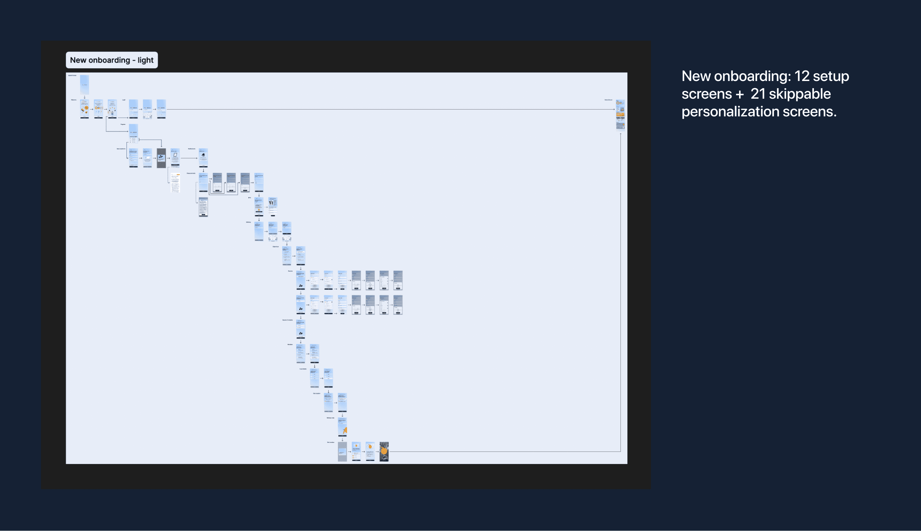
The onboarding experience was redesigned to shift from a generic, lengthy flow into a personalized and performance-driven entry point. By simplifying the structure, introducing adaptive inputs, and supporting both light and dark modes, the new onboarding aligns with athletes’ expectations—fast, focused, and tailored. The result is a clearer first impression that connects the product’s value from the very beginning.
Project Description
The original onboarding created friction early in the experience. It was too long, too generic, and felt similar to standard calorie-tracking apps—failing to reflect the product’s performance-focused value.
The redesign focused on making onboarding more intentional and relevant.
The flow was simplified into fewer, more meaningful steps, prioritizing key inputs that directly affect the user’s nutrition plan. Personalization became central—allowing users to feel the system adapting to them from the start. The visual language was updated to match the product’s evolving identity, with a stronger emphasis on clarity, hierarchy, and energy, and the addition of micro-animations made the whole experience feel more dynamic.
Light and dark modes were introduced as part of both usability and brand expression. This allowed the experience to adapt to different contexts—training, recovery, day or night—while reinforcing a more premium and flexible product feel.
The result is an onboarding that feels faster, more relevant, and aligned with the needs of athletes.
Contribution
Led the end-to-end onboarding redesign:
UX/UI design (flows, interaction, high-fidelity screens),
Product thinking (personalization logic, step prioritization),
Visual system (light/dark themes, typography, hierarchy),
Collaboration with founder and developers (iOS & Android implementation).
Impact
+23% onboarding completion rate
−40% time to complete onboarding
+22% activation rate (users reaching first plan)
Improved early retention and engagement. Impact driven by relevance, speed, and clarity.
Credits
Trip2Balance, Product
Founder & Development Team
Tools
Figma
Maze